Coffee Quality Visualization
The Coffee Quality Visualization Project leverages the power of D3.js to transform detailed coffee production data into visually striking and information-rich displays, providing a unique perspective on the global coffee landscape.
Data Overview
The data for this project comes from the Coffee Quality Institute (CQI), a non-profit entity committed to enhancing the quality and worth of coffee globally.
This dataset offers a comprehensive snapshot of the coffee industry across numerous countries, painting a vivid picture of the global coffee scene. It includes information on:
- Production by country or region.
- Total cup points, a measure of coffee quality.
- The geographic spread of coffee-growing areas.
- Detailed sensory evaluations of coffee, covering characteristics like aroma, flavor, aftertaste, acidity, body, balance, uniformity, clean cup, and overall sweetness.
Visualization
Coffee Quality Visualization includes the World Map, Grid Layout, Parallel Coordinates Plot, and Box Plot.
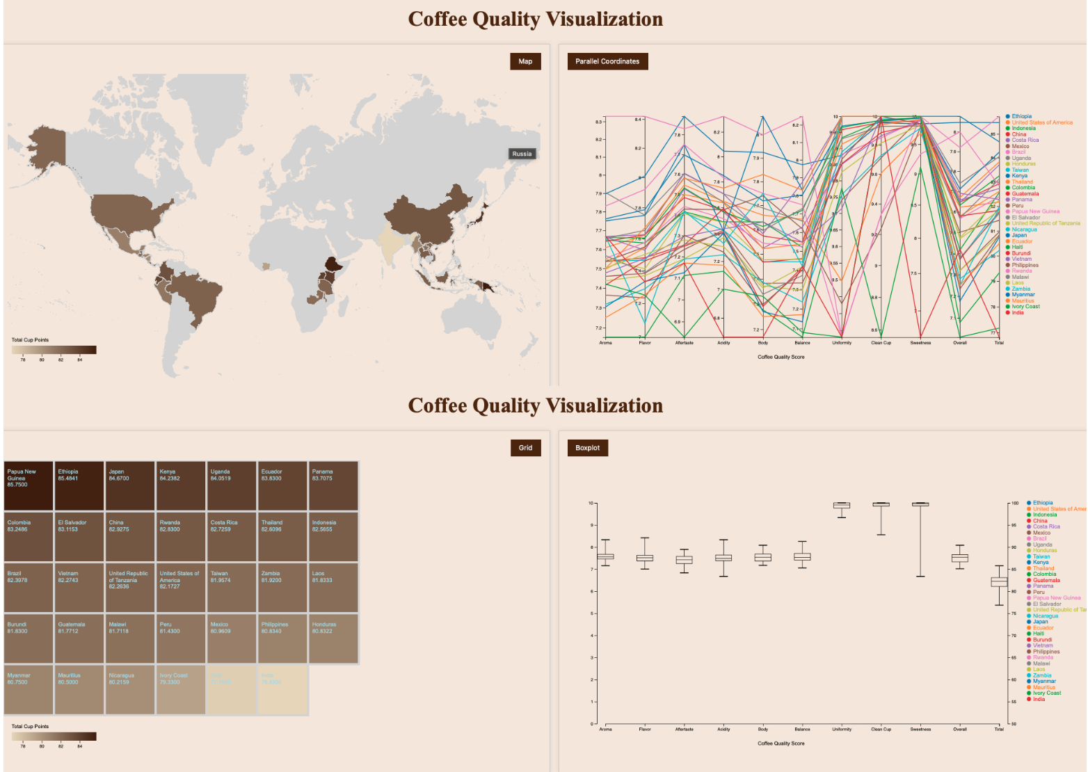
This project incorporates brushing and linking techniques, enabling dynamic interaction across different visualizations. When users select a specific country on the World Map or the Grid Layout, this action triggers an automatic highlighting of the corresponding data in the Parallel Coordinates Plot. Additionally, it can also display the Box plot for selected countries, offering a detailed view of coffee quality scores.